
How We Rebuilt Our Design Language in Three Days with AI
blog.curiosity.ai
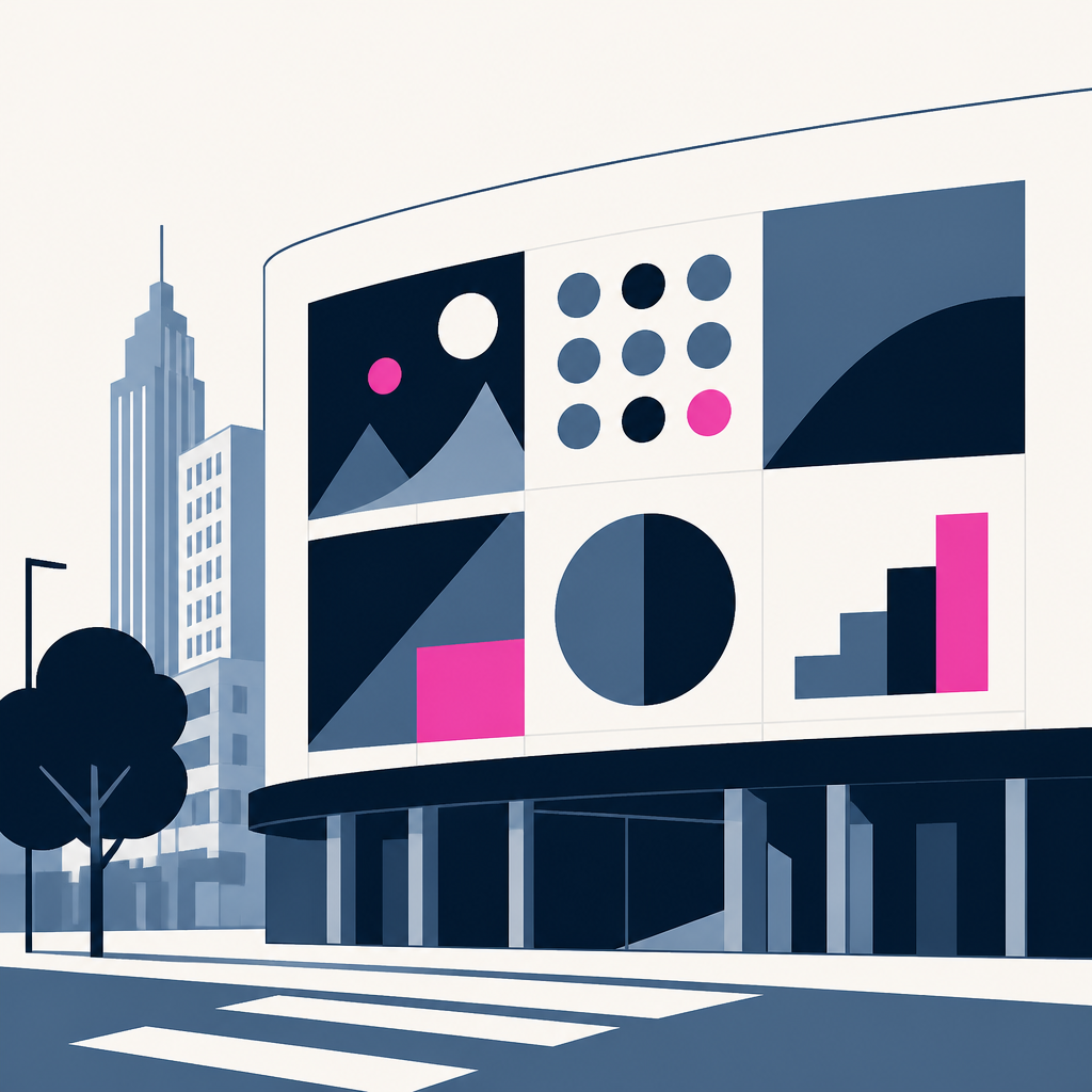
A German software company rebuilt 67 pages as a Bauhaus poster, then swapped the whole brand in three days. The wild part: the AI found layout bugs and tiny text problems humans missed.
Based on reporting by blog.curiosity.ai — read the original for the full story.
Summary, retelling and take written by AI under human oversight; images are AI-generated illustrations. How we work · Report an error
Curiosity.ai started with a weirdly specific question: what would its site look like as a Bauhaus poster? By the next afternoon, the answer existed. The entire site — all 67 pages — had been rebuilt in that style, with circles, triangles, squares, one typeface, no shadows and no gradients.
That first pass wasn’t just pretty. It also exposed mistakes. A responsive check claimed everything passed, but the test had broken itself and skipped the pages. Once fixed, it found 43 diagram labels that would have sunk below 9px on a phone. That’s the real story here: the model could follow a strict brief closely, but it also surfaced the kind of flaws a rushed human might wave through.
From there, the team stopped treating design as a single answer and started treating it as a search. They built 21 more versions of the site, each a full copy with its own stylesheet, shell and drawing logic, so one direction couldn’t compromise another. Some were safe. Some were odd on purpose: Desktop Dither, Poster Wall, Sudo Pixel, Exploded View, Departure Board, Soft Editorial SaaS. Each started from a short brief and then got revised after review, whether the issue was a palette that read too much like a consumer brand or labels that turned tiny on a phone.
The judging didn’t happen in twenty-two tabs. They built a small comparison game with live previews, group stages and a knockout round of 47 matches. Yarn Mosaic won, and the others were deleted. Then the same machinery carried the result into the brand work itself: one file, BRAND.md, became the rulebook for the site, blog, docs and slides. On September 28 the site was restyled again, and on September 29 a blended version became the default. The repository ended up with about two hundred commits across those three days, all driven by text the system could read and rewrite.
What makes this interesting is not that AI made a website faster. It’s that the company used AI to make taste legible, then made the taste machine-readable too. That’s a more serious trick than slapping on a theme and calling it innovation.
My take — AI-written commentary, not fact-checked reporting
This is the right way to use AI in design: as a tireless junior that can explore, compare and document, not as a magic painter with a product team. The open-ended prompt crowd keeps selling mystery; the useful work is in tight rules, repeatable systems and a human willing to say no to the weird cat when it gets too cute.
Read more about this at: blog.curiosity.ai