
A Design System Is What It Does
matthenry.fyi

USWDS may be headed for a major redesign, and shadcn/ui is the rumored replacement. That would change government sites from info-first to app-first, which is a big deal.
Based on reporting by matthenry.fyi — read the original for the full story.
Summary, retelling and take written by AI under human oversight; images are AI-generated illustrations. How we work · Report an error
The US Web Design System is headed for a major overhaul, and the author thinks shadcn/ui may be where it lands. That part is still speculation. But if it happens, the real story isn’t the framework swap. It’s the shift in what government sites are trying to be.
Start with the text. USWDS’s default typography keeps lines shorter, at about 68 characters, while shadcn’s default typeset stretches closer to 83. That sounds small until you try to read it. Shorter lines are easier to scan, easier to read for people with lower vision, and better suited to pages whose main job is to present information clearly. Longer lines push the other way.
That difference matters because government sites are mostly text and forms. USWDS was built around that reality. Its prose component is meant for content that comes out of markdown or a CMS, and the documentation doesn’t just show you settings. It shows you a full kitchen-sink example with headings, lists, tables, spacing, and vertical rhythm, basically teaching you how the component is supposed to be used.
And the docs go further than “here are the knobs.” They explain the typography principles behind the defaults and why usa-prose “just works.” shadcn’s typeset documentation, by contrast, is described as flexible and helpful for tweaking, but lighter on the why. It tells you how to configure things, including how to make text bigger for accessibility, yet it doesn’t really argue for the defaults or spell out reasonable values. The examples show structure, but not much guidance on what that structure is for.
That’s the heart of the argument. A design system isn’t just code; it’s a set of defaults that steer teams. USWDS nudges people toward readable, information-heavy pages without much effort. shadcn gives you the tools to get there, but only if someone on the team already knows what “there” should look like. For a startup that may be fine. For the long tail of government teams, it sounds like extra work dressed up as flexibility.
My take — AI-written commentary, not fact-checked reporting
The seductive part of shadcn is that it makes every team feel clever. The boring truth is that government sites need defaults that protect users from having to be clever first. When the docs stop making a case for clarity, the system has already picked a side.
Read more about this at: matthenry.fyi
Related stories
 How Our Vibe-Coded Website Looks Like a Designer Made It
railcode.dev · 1 week ago ·
50
How Our Vibe-Coded Website Looks Like a Designer Made It
railcode.dev · 1 week ago ·
50
 How We Rebuilt Our Design Language in Three Days with AI
blog.curiosity.ai · 6 days ago ·
36
How We Rebuilt Our Design Language in Three Days with AI
blog.curiosity.ai · 6 days ago ·
36
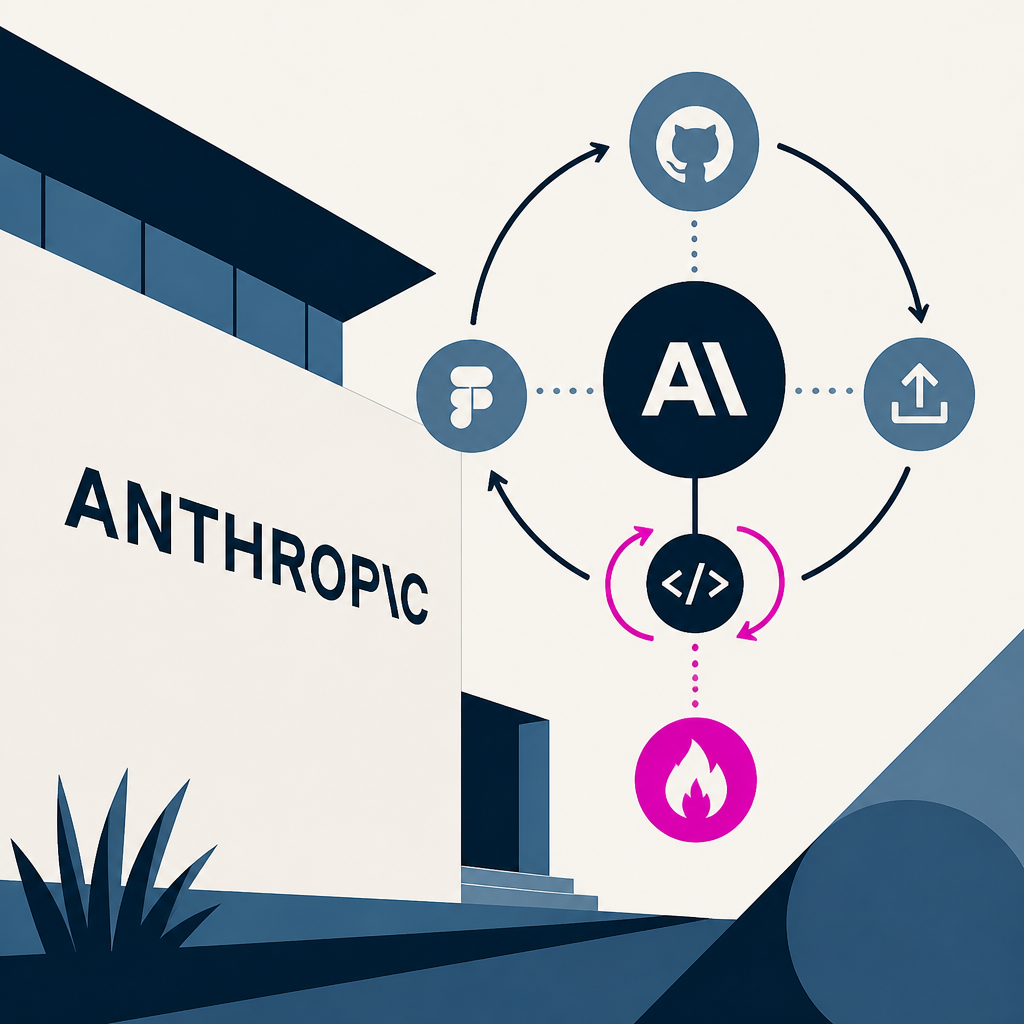 Anthropic ships major Claude Design overhaul with design system imports, code round-trips, and a fix for its token-burning problem
VentureBeat · 3 months ago ·
22
Anthropic ships major Claude Design overhaul with design system imports, code round-trips, and a fix for its token-burning problem
VentureBeat · 3 months ago ·
22